Hello World!
Finally the day came when I (re)published my website! In this blog post I talk a bit about the design & development process and the technology behind this website. There's still lot of work to be done with it but even so I decided to launch it, otherwise I will keep tinkering with it forever!
This blog post is fully about the website itself, if you wish to get to know a bit about me, then check out the About page!
Background 
I've always believed that a web developer - especially a frontend developer - should have a personal website, but during previous years this hasn't actually been the situation with myself, since I've shutdown my previous website around 2015. You can still view the aripalo.fi website on Wayback Machine. Before that, I had a bit more modest website that I started way back in 2004.
Now after several years without a website - and many plans & design ideas - it is finally time to set one up again! In this day and age it's quite common to publish technical blog posts on various content platforms suchs as Medium.com or Dev.to, and even I have done it couple of times; Call me old fashioned, but I long for the times when everyone had their own website for blogging. Consider this my contribution on that matter!
Typography 
I've always been somewhat obsessed with typography; Not an expert on the subject, but still, obsessed. With websites, having a nice typography usually means having various webfonts loaded into the page, which in turn is bad for performance. Nowadays browsers do support quite well variable fonts, where a single font file can "adapt" to multiple weights, but there aren't that many actual nice typefaces offered as variable fonts. So I decided that for this site I will only use a single typeface with multiple weights, so at least only different font files for different weights of a signle typeface need to be downloaded.
I took quite a long time actually to find a typeface I was really satisfied with and one that offered a reasonable priced licensing. I do appreciate typefaces and for example at work I have purchased webfonts that some might call expensive, but I believe a good typeface can have a huge impact; Then again, this is a personal website and I am not making any money via it, so that affected my price range.
At the end I found an awesome typeface called “Greycliff” from US based designer Connary Fagen. I instantly fell in love with it, since it works rather well in both bold headings and in regular body text. Combining that to the fact I got a 500K/webviews per month web licence (bundled with a desktop licence) from FontSpring for around $60 was a great deal!
Design 
I started working with the design in Figma with mobile-first design and then moved into designing wider viewports with iPad-size frames.
Basic idea was to use dark violet color as the background and some bright colors for text. For each article there'll be a vector graphic accompanying the content. Most of the graphics I will be making myself, but some - such as the world map in this article - I bought as stock photo because I was lazy. I wanted to keep the layout quite simple at the end, but did some fancy adjustments for wider screens.

Static Site Generation 
Building the website with static site generator was a no brainer. I've worked with content management systems such as WordPress a lot in the past, but with this website there's no need for such dynamic content and having static pages keeps the hosting cost low and performance great. Also some of the future blog post can have a bit more complex layouts, so having a possibility to write Markdown powered by a templating engine is a good option to have. Also I had decided that the static site generator must be NodeJS based, since the ecosystem has a lot of great tools available.
Already at the beginning I considered 11ty, but I also liked the idea of using JSX with ReactJS to define the views and components. I've been using GatsbyJS in the past, and even contributed into it, but I still feel that for a simple blog website Gatsby can be an overkill (even though I do know GraphQL rather well); So I looked around for ReactJS based static site generators, but they all seem to ship client-side React as well for “blazing fast performance”, which is nice but on a principle I don't want to use client-side ReactJS in a simple blog website. I even considered building my own setup, but after a while of hacking I thought it's too much work for this use case.
In the end I went with 11ty and I'm super happy that I did. I've previously built almamedia.dev website with it. This time I did choose Nunjucks for templating language (instead of Handlebars which I've used before); I do have some issues with VS Code IntelliSense & autocompletion not working well with it, but I suspect it's a problem with my configuration.
On top of 11ty, I use multiple 11ty and markdown-it plugins. Assets are managed via Webpack with Babel, PostCSS and multiple PostCSS plugins.
I might release the setup as 11ty starter pack at some time in the future. We'll see.
Make it pop 
The whole design is pretty traditional blog layout at the end, especially on mobile sizes, but I wanted to include few interesting things here and there: To “delight the user” so to speak.
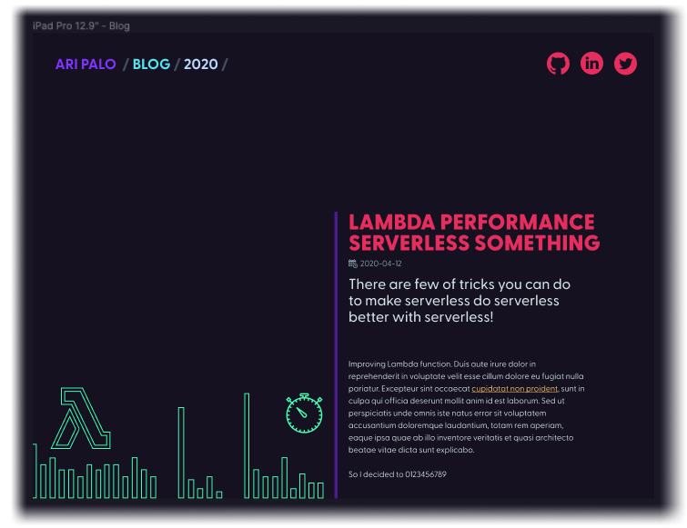
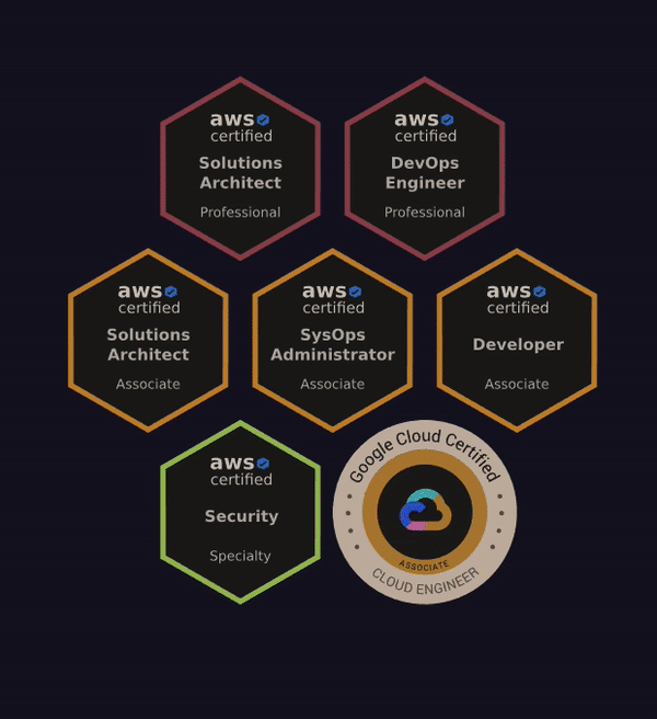
One example is the SVG & CSS animation on the frontpage. The whole operation took quite a lot of time since neither AWS or GCP do not provide official vector files for their certification badges and I first started working with the offical bitmap images, which resulted in a awful lot of work trying to optimize responsive images to achieve good performance (and that Lighthouse score of 100). After way too much time spent on that, I did some googling around and found out some unofficial AWS badges in SVG format and then I used Adobe Illustrator to extract the GCP certificate badge from my official PDF certificate. Hopefully neither AWS or GCP will sue me for this 😅. Once I got the SVG badges, it was time to work on with the positioning, keyframe animations and filters. In short, the animation is achieved with:
@keyframes pop {
  0% { transform: scale3d(0, 0, 1); }
  75% { transform: scale3d(1.4, 1.4, 1); }
  100% { transform: scale3d(1, 1, 1); }
}

.badge > svg {
  animation-duration: 0.6s;
  animation-name: pop;
  animation-iteration-count: 1;
  animation-direction: normal;
  animation-fill-mode: both;
  animation-play-state: running;
}

/* increasing the delay with 0.2s per element */
.badge:nth-of-type(2) > svg { animation-delay: 0.2s; }
.badge:nth-of-type(3) > svg { animation-delay: 0.4s; }
Finally there's some hover tricks done with CSS transforms and filters:
.badge {
  will-change: transform;
  transition: all 0.15s ease-in-out;
  filter: invert(90%) sepia(20%);
}
.badge:hover {
  transform: scale3d(1.6, 1.6, 1);
  z-index: 10;
  filter: invert(0%) sepia(0%);
}
Annoyingly, the scaled SVG is blurry on Safari, I'll have to keep investigating.
Performance 
Web performance is critically important for me, due to professional pride (since I used to be a frontend developer), better user experience and because of SEO. Lighthouse scores are just numbers and not important by themselves, but I wanted to aim having a “perfect” 100+100+100+100 score - which most of the pages in this website should achieve!
Achieving good performance wasn't that tricky with this site to be honest, since again, it's a static site. Biggest wins happen by reducing the amount of resources downloaded, which I pretty much achieved by lazily loading most of the images with loading="lazy" attribute, inlining some of the smaller SVG-icons and finally having a single CSS file for the critical rendering path that is inlined into the HTML.
Some might point out that inlining the CSS is bad for caching, but I went on and assumed that most of the traffic will be a single pageview on a single blog post. In any case, I have defined a performance budget with WebPack to break the build if a CSS asset filesize is bigger than 18KB, so having few kilobytes extra in the initial HTML doesn't sound that bad to me.
Also the site does not contain any client-side JavaScript on most pages: Currently only pages that have either Youtube or Spotify embeds load some JavaScript.
Further optimizations should include responsive images, but at the moment I haven't done that since most pages only contain few images that are lazy loaded.
Analytics 
I don't want to track any of the visitors (or to have those annoying cookie disclaimers), but I do want to know how many times an article page have been opened and a general idea of from which countries the traffic comes from. Therefore I decided to utilize AWS CloudFront access logs which are enabled on the CDN distribution.
Later I will implement AWS Athena + QuickSight (two AWS products I want to learn more) based analytics on the CloudFront access logs, which will be a separate blog post.
Infrastructure 
The whole AWS CloudFront + S3 infrastructure is defined with AWS Cloud Development Kit and deployed manually since the infra itself does not change that often at this point. This though can change in the future.
I know, there are easier setups for static sites, such as Vercel or Netfily, but since I'm really familiar with the AWS setup I went with it. Also the analytics aspect with Athena & QuickSight was a factor.
Continuous Integration 
I use pretty much similar deployment flow that I've defined at Alma Media - a.k.a. “Alma Media Git Deploy Flow” - which is used by several projects over there.
A commit to Github branch feature/something results to feature.aripalo.com/something, commit to Github master is consider a staging deployment and a tagged commit - via Github releases - will be considered as production deployment. Later on, only production URL is accessible to internet, others require an authentication step. This flow allows relatively easy preview deployments before production via feature branches and staging.
| branch@tag | deployment | target |
|---|---|---|
feature/x | feature | feature.aripalo.com/x |
master | staging | staging.aripalo.com |
master@n.n.n | production | aripalo.com |
By looking at the diagram, one could - justifiably so - think that the version control flow & deployment model is quite complex for a single static site, but again this is the model I am really familiar with and it provides the feature/preview builds. Originally I developed it for somewhat more complex projects, but it works fine with this as well.
Sometimes you can see nails everywhere and you just use the hammer you're familiar with!
The actual CI/CD implementation in the end is quite simple, using Github actions just to deploy static content to correct S3 bucket.

Release it! 
There's still much to be done, but now it's out there. I'll keep tinkering with it.
If you spot a bug or have some other feedback about the website, drop me a line at webmaster@aripalo.com or send a DM on Twitter.